Sundt Construction
Client Background
Founded in 1890, Sundt Construction, Inc. is one of the country’s largest and most innovative and respected general contractors, performing work in the transportation, industrial and building markets. The 100 percent employee-owned company is consistently ranked among the 100 largest general contractors in the United States and was named the nation’s safest construction company by the Associated General Contractors of America in 2006 and 2016.
The Challenge
With three business units, Sundt sought to build a brand that accommodated those distinct voices to market themselves, but also fostered a unified culture. Sundt was losing market share to bigger and smaller competitors in new and existing markets across the country. As one member of the executive team described it, they were losing opportunities for RFPs because “people don’t know who we are…we don’t know who we are.” As a result, Sundt was looking at a decline in revenue – despite a thriving economy – and they were losing recruiting opportunities to smaller firms that understood how to build a brand that connected with prospective employees.
The Tools
The Inspiration
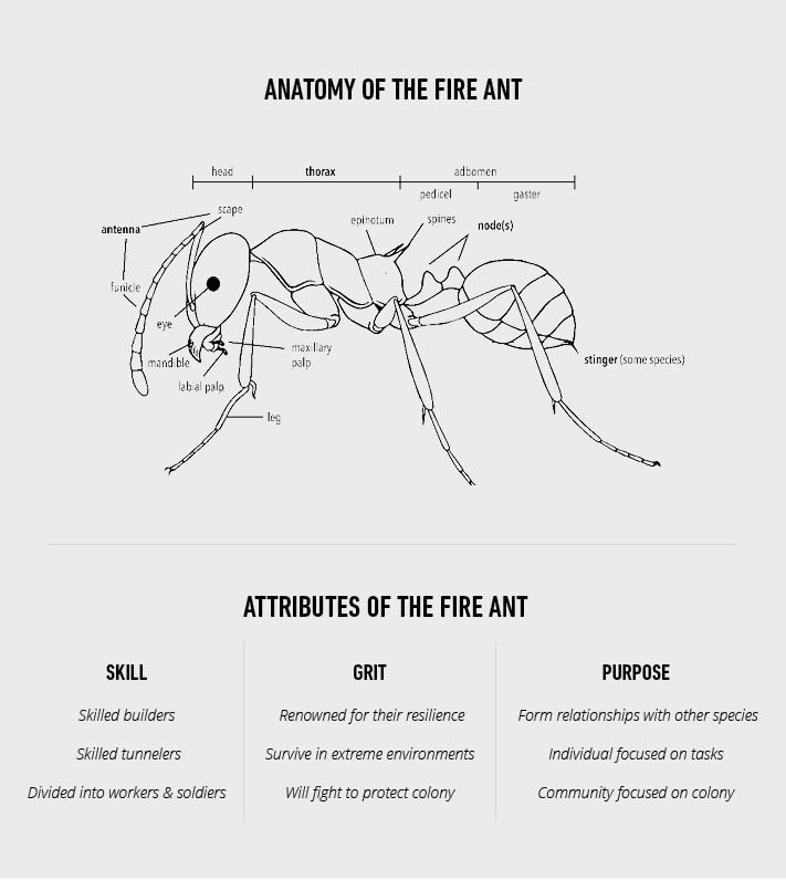
During a hike on Camelback Mountain in Phoenix, WHYFOR founder Rob Nicoletti sat down on a rock and noticed a line of fire ants marching in a column across the desert trail. (Yes, they got his attention when one of them bit him on his hand.) It occurred to him that they were emblematic of the Sundt culture: vulnerable as separate entities, yet coming together and working relentlessly for a common purpose; humble, yet incredibly successful at constructing enormous, complex structures.
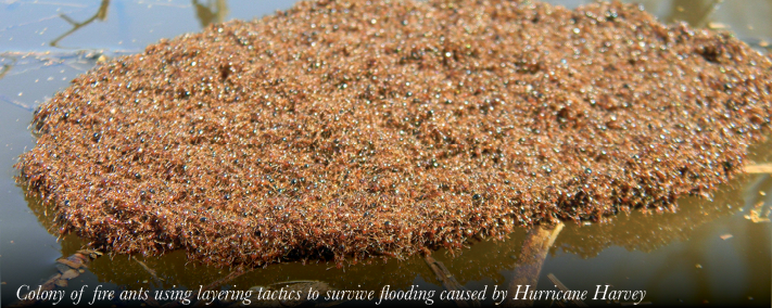
When he returned to the office, Rob began researching and found that fire ants were an even better business metaphor than he realized: an incredibly resilient species of builders and tunnelers that can survive extreme heat, cold, and drought. During floods, fire ants raft together, rotating the stronger colony members below the water while the weaker ones stay protected on top – much in the way Sundt’s different business units support each other during challenging times. Finally, they have uniquely synergistic relationships with other insects, which was analogous to Sundt’s reputation for successful collaboration with other builders, architects, designers, and city engineers and planners.
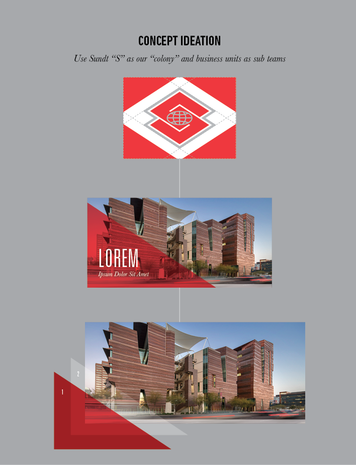
The Creative Concept
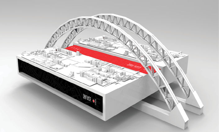
The question then became how to apply this micro concept to the overall brand positioning and its use within a diverse company that’s capable of building anything from skyscrapers and NASA launch pads to numerous buildings at the University of Arizona.
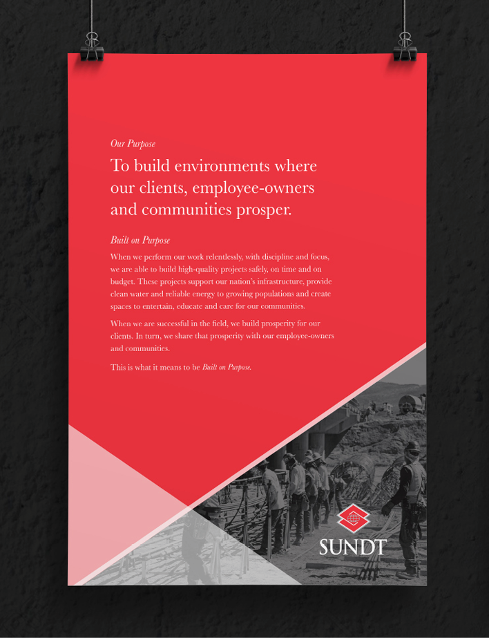
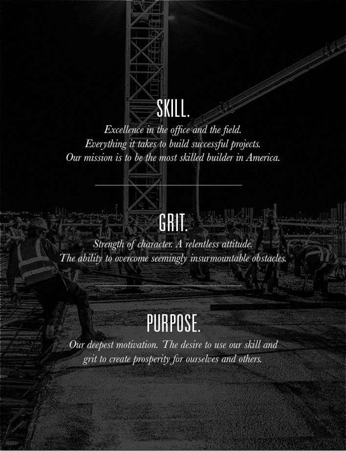
The rebranding process was a comprehensive exercise that included employee surveys and discussions with upper management. In alignment with the so-called Sundt-speak that had evolved over more than a century, the creative team defined every element from mission statements and taglines to a purpose statement: “To build environments where our clients, employee-owners and communities prosper.” In keeping with the fire ant theme, the WHYFOR creative team condensed the internal messaging into a simple phrase to reflect Sundt’s core values: “Skill, Grit, and Purpose.”
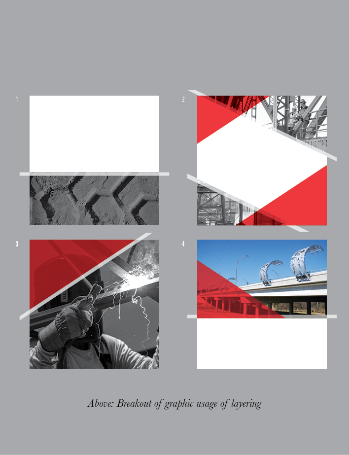
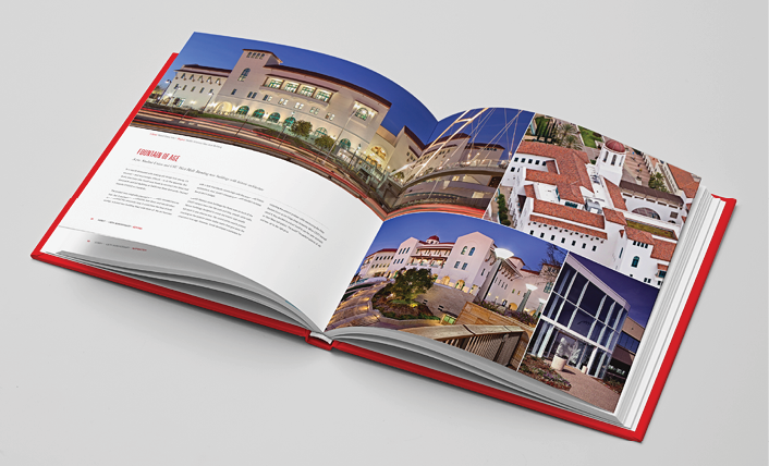
While the longtime Sundt “S” logo was retained, the brand guidelines and design approach needed to present a more cohesive visual image for the four business units. The “S” became the center of the colony, creating segmented lines and patterns that could be layered with the brand colors, different textures, and appropriate photography to distinguish the separate industries in everything from business cards and brochures to digital communications. The graphic design scheme reflects WHYFOR’s philosophy of “Design with Purpose,” providing content in small, medium, and large segments to facilitate influence depending on the level of reader interaction (awareness, interest, consideration or decision).