Category: Case Studies
GO Car Wash

Client Background
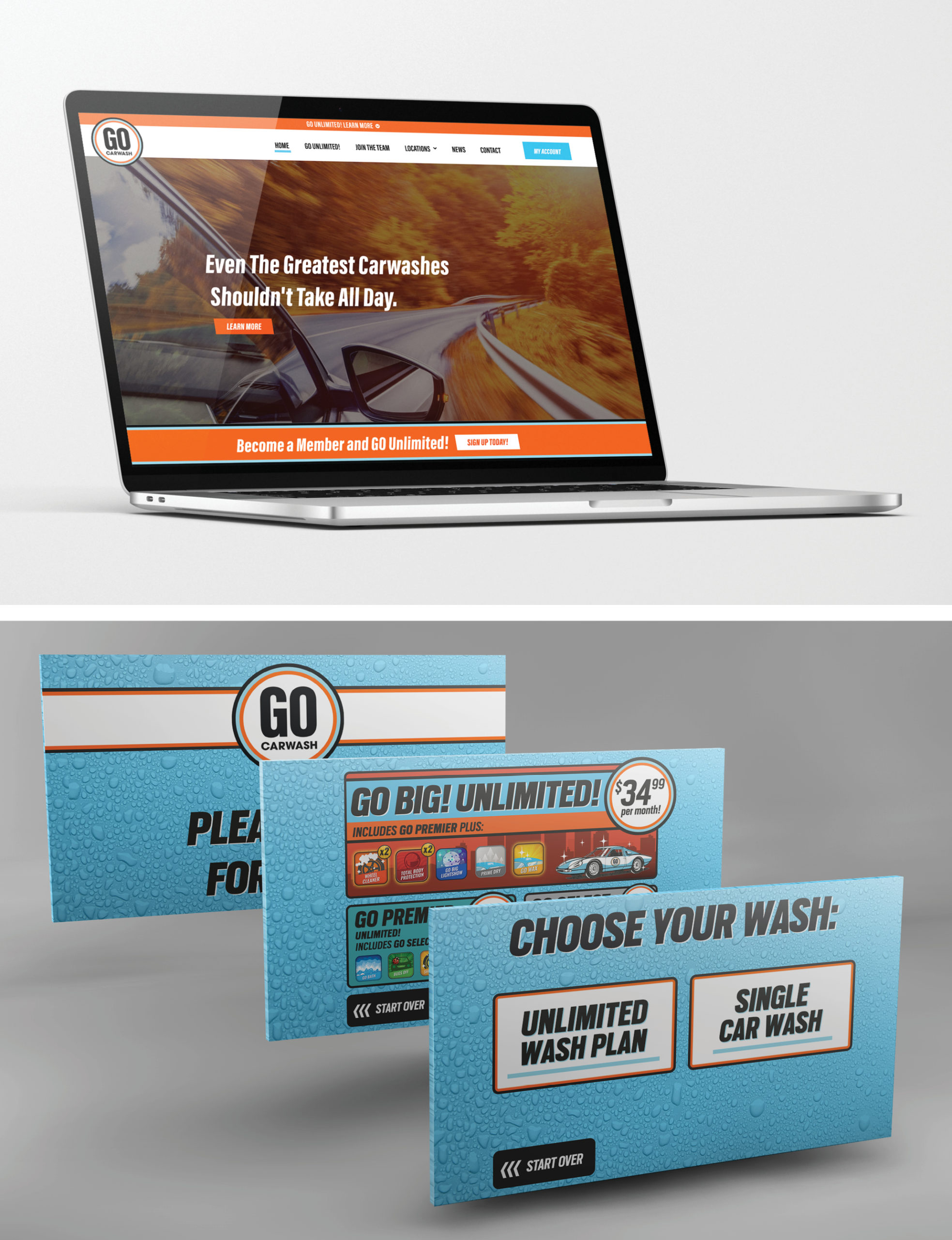
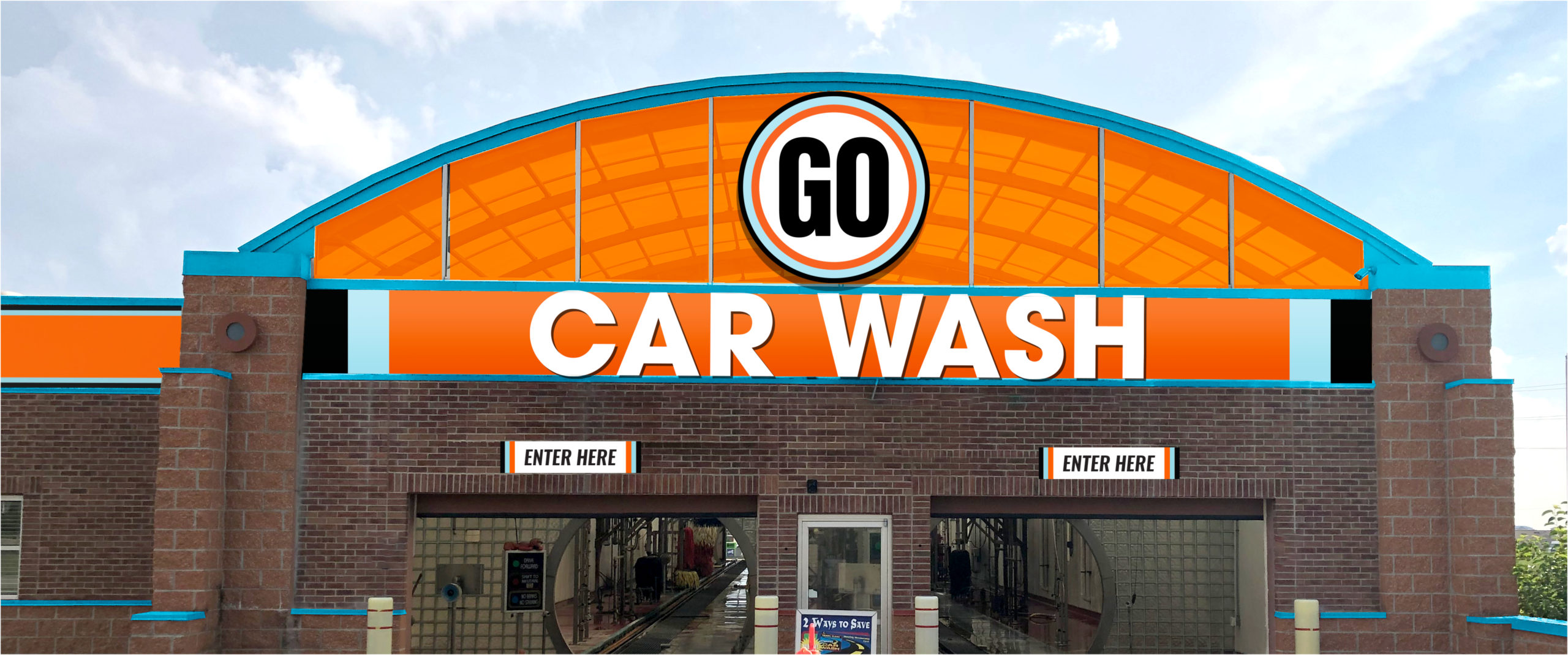
GO Car Wash, a growth-minded, drive-thru car wash experience, began small — with locations in Kansas and Missouri — and expanded by adding locations in Nevada and Texas. By assuming ownership of an already operational car wash, GO Car Wash simply needed to rebrand and establish its own presence in the market and carry that through to each new location.
The Challenge
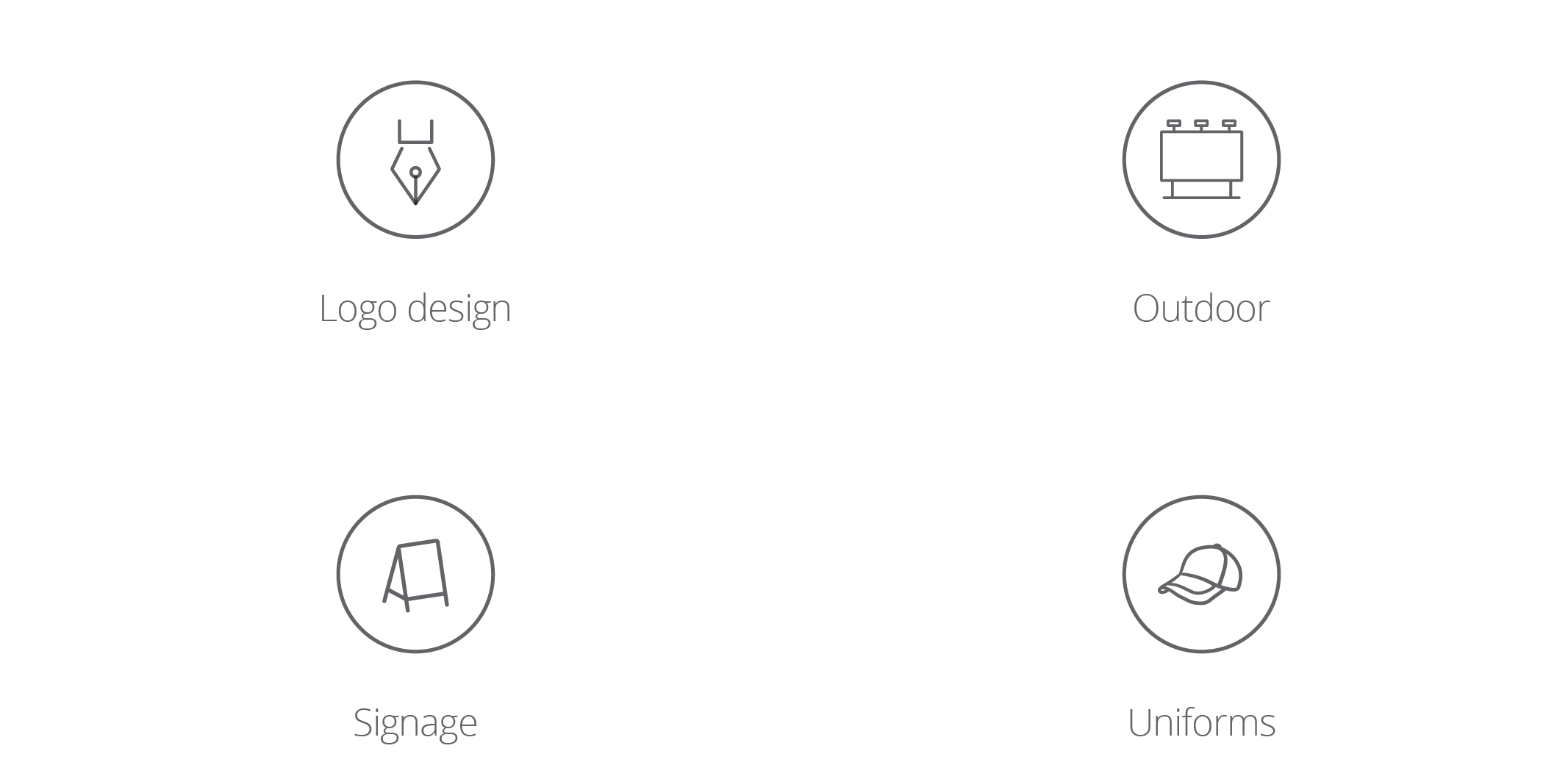
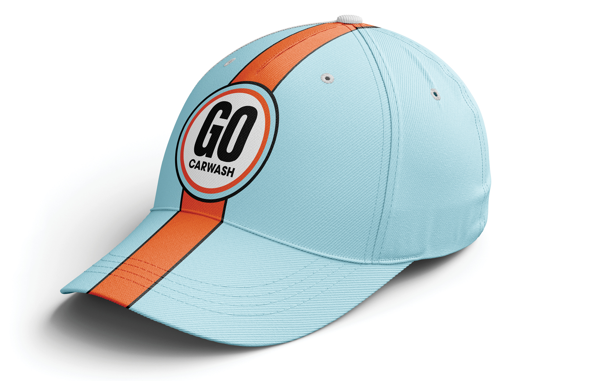
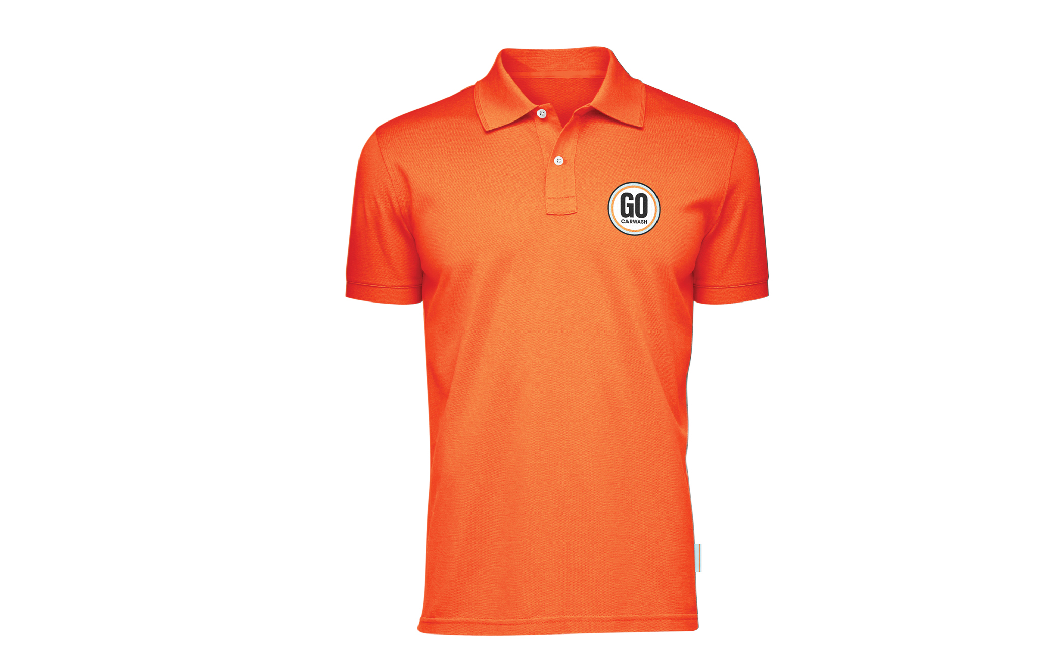
GO Car Wash, operating in a quick-serve industry that offers minimal customer interaction, needed to find a way to establish a memorable, friendly brand presence that stood out from its competitors and resonated with drivers who love their vehicles. That branding would need to be used across exterior signage, on its website, in any advertising and on employee uniforms.
The Tools
The Opportunity
Market research indicated an opportunity for playful messaging with a nostalgic feel, leaning on a theme of exploration told through an authentic, relatable voice.
The Creative Concept
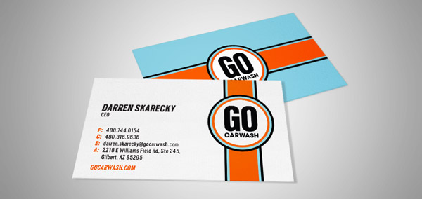
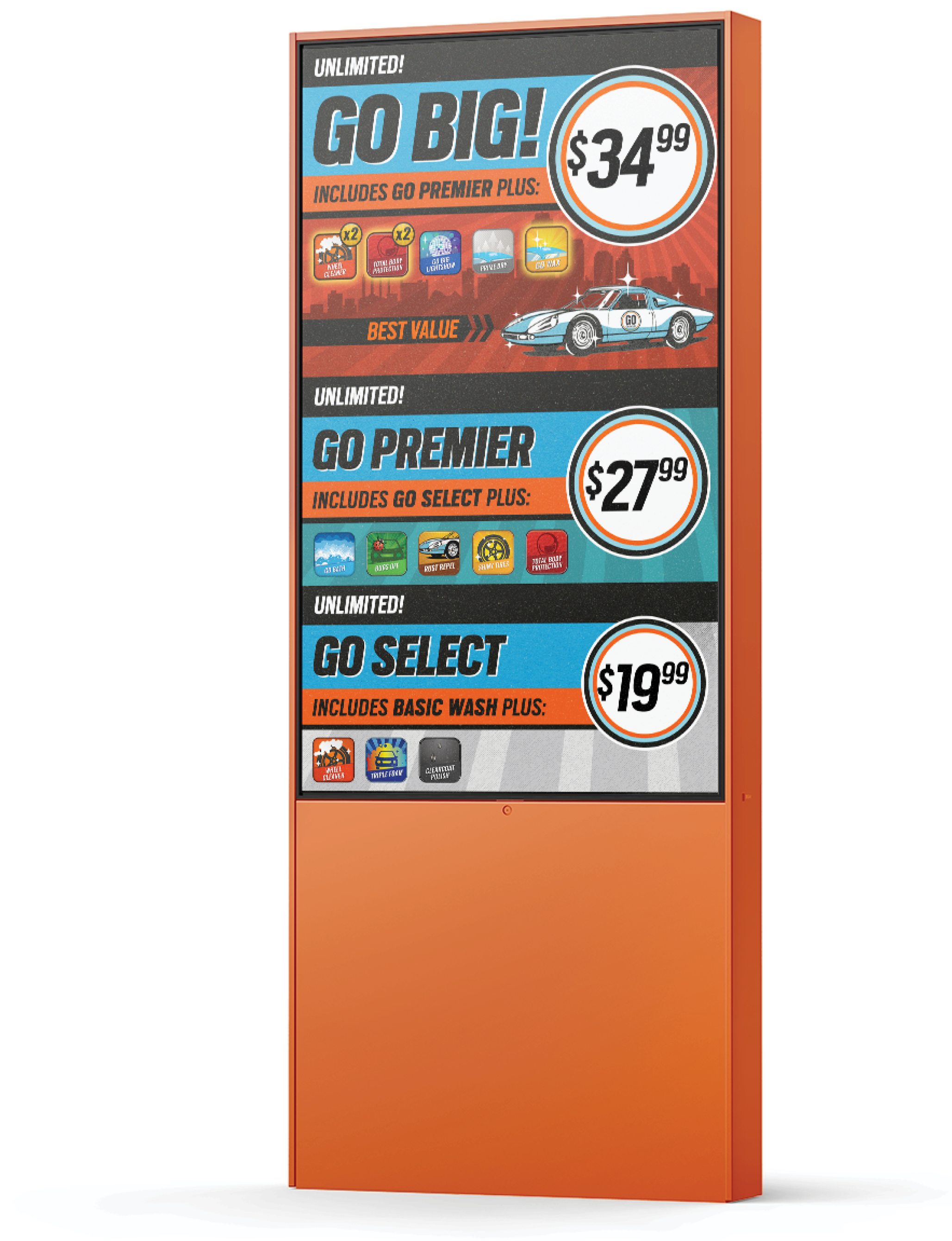
After considering a brand refresh versus a full rebrand, GO Car Wash chose the look and feel of an entirely new concept, which relied on a retro color scheme courtesy the Gulf GT40 Livery, incorporated the feel and experience reminiscent of a pit crew and showcased a clean, vintage energy.


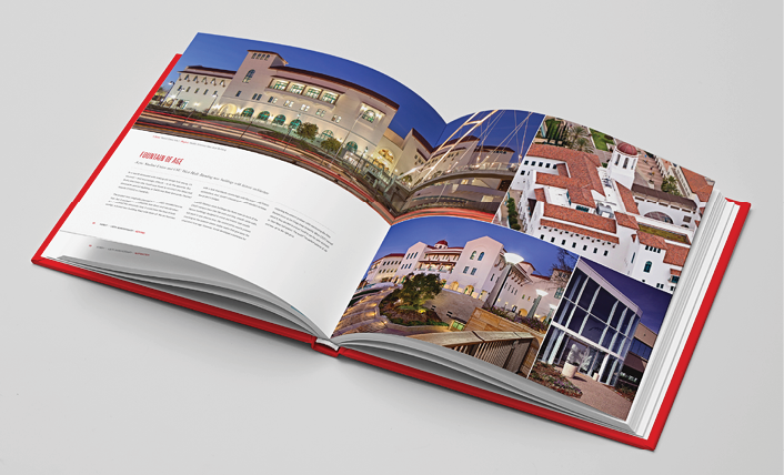
Avenues: Celebration of Fine Art

Client Background
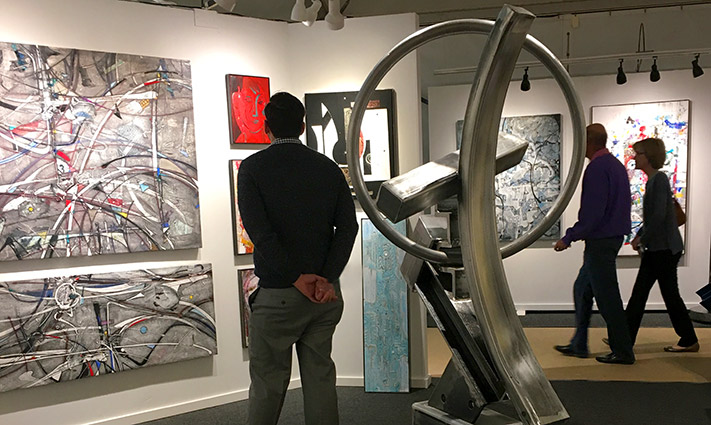
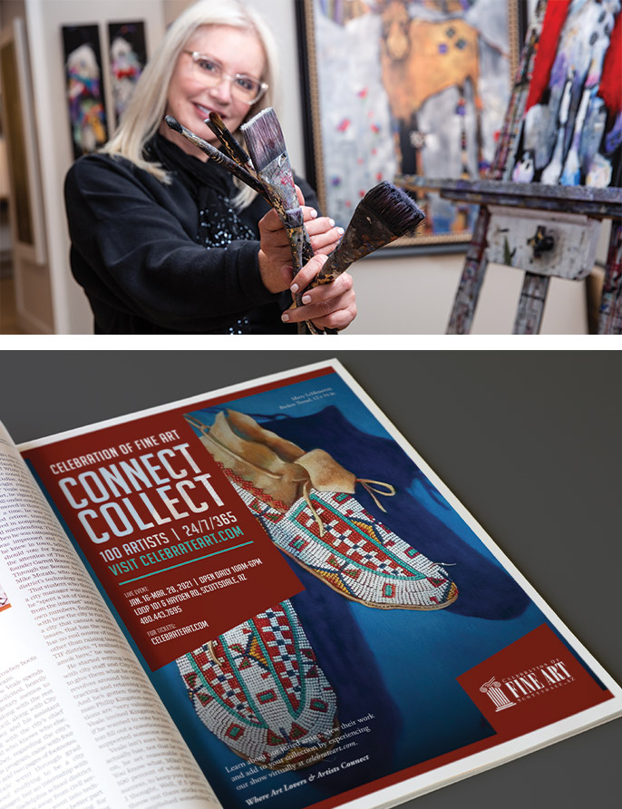
For 30 years, the Celebration of Fine Art has connected art lovers with artists by hosting a 10-week art show in Scottsdale under what has become known as CFA’s “big white tents.” The show brings together 100 juried artists who work in a variety of mediums and set up temporary studios inside the tent in order to engage with collectors as they create new pieces.
The Challenge
The COVID-19 pandemic cut short CFA’s 2020 show, which begins every year in January and runs through March. Gatherings were suspended, which led to travel restrictions and local quarantine periods. In order to recoup lost revenue and prepare for a 2021 show that may still face similar social distancing restrictions, CFA had to meet collectors where they were — at home. As an in-person event for its entire existence, CFA needed a strategy to determine which avenues to use to reach a new audience in a new era.
The Tools


The Opportunity
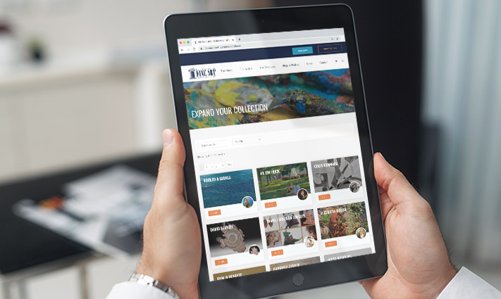
As an iconic event that leveraged the in-person connections attendees could make with artists, CFA had long considered developing an online marketplace where collectors and artists could connect at any hour of the day, during any season. The pandemic, and the impact it had on business, inspired CFA to implement that vision. An Avenues Plan, guided by WHYFOR’s proprietary L.A.B.S. process, allowed CFA to see which audiences it would be targeting with its new platform and understand how to reach them.
Because the online art-buying world is different than the in-person one. Different audiences use different avenues.
The creative concept:
Since branding remained consistent, WHYFOR worked with CFA to build its marketplace as an integrated experience on its current website. When creating the shop, WHYFOR was mindful of keeping it user friendly and artist friendly, since CFA wasn’t sure how many artists would participate in the online version — especially if the process was complicated.
This marketplace was to be an extension of the premium in-person experience people have come to know and it would also act as a gateway for new audiences experiencing CFA for the first time, which meant every detail was crucial.
The aha moment
After WHYFOR completed a thorough analysis of CFA’s in-person and online audiences, it finalized an Avenues Plan that dovetailed with CFA’s content marketing plan. In addition, WHYFOR helped CFA manage artist relations by crafting an email campaign, developing painstakingly detailed instructions on how to create a virtual storefront and producing video tutorials to complement those written instructions.
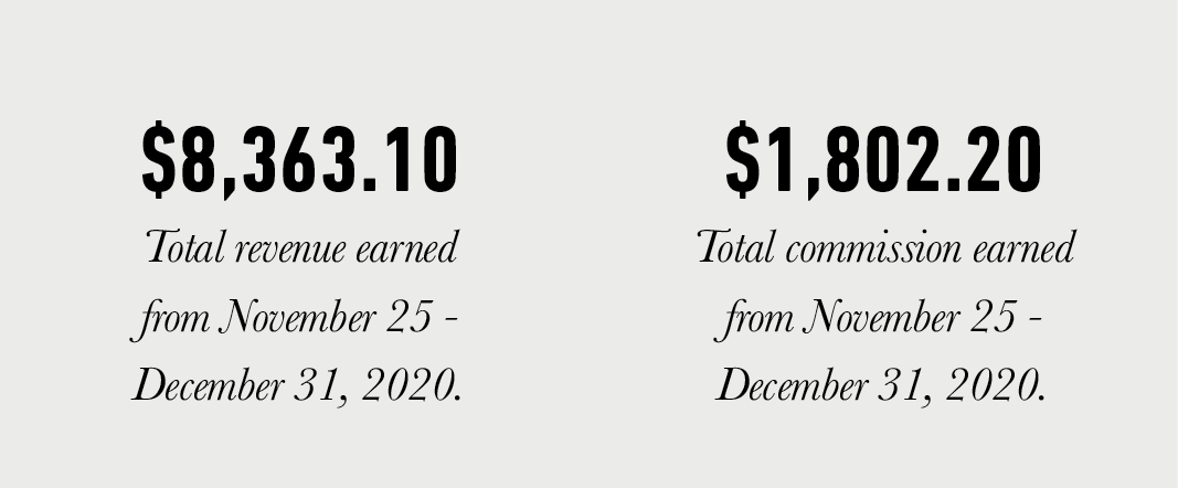
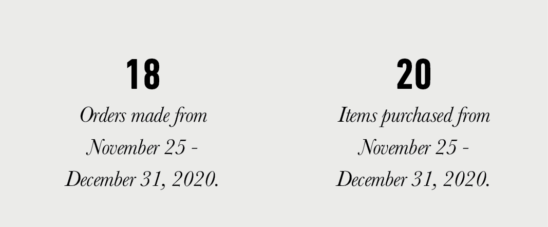
The end product? An easy-to-navigate online marketplace that allows artists to create individual storefronts and collectors from around the globe to browse and buy at any hour of the day.
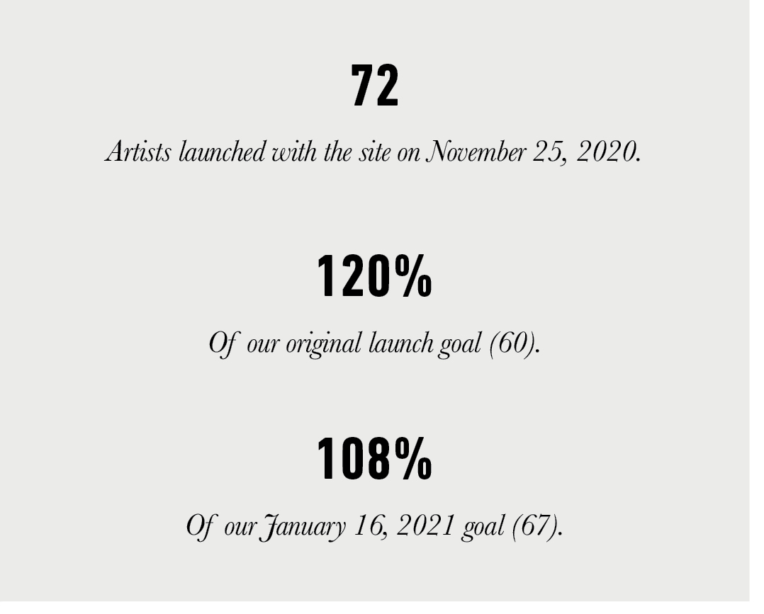
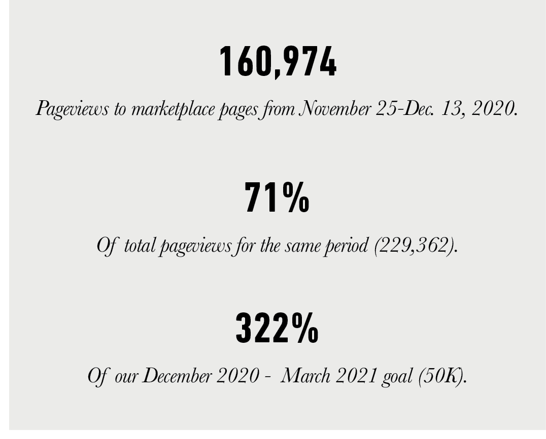
Knowing the participation of its existing artist base was crucial for the success of its new e-commerce presence, CFA aimed to have 60 artists integrated into the platform by the time it launched, just after Thanksgiving in 2020. Coordinated external communications in print, digital, email and across social channels aided awareness for the launch effort.
How’d it go? It almost seemed like the artists, and the collectors, were waiting for something like this.
The Results

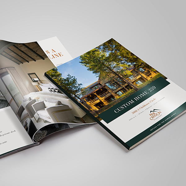
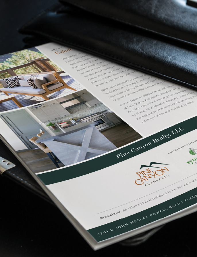
Anatomy: Pine Canyon
Client Background
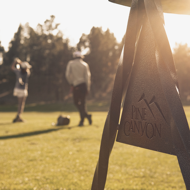
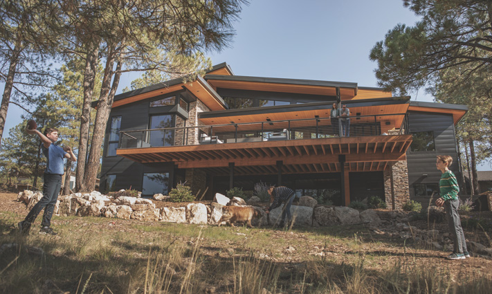
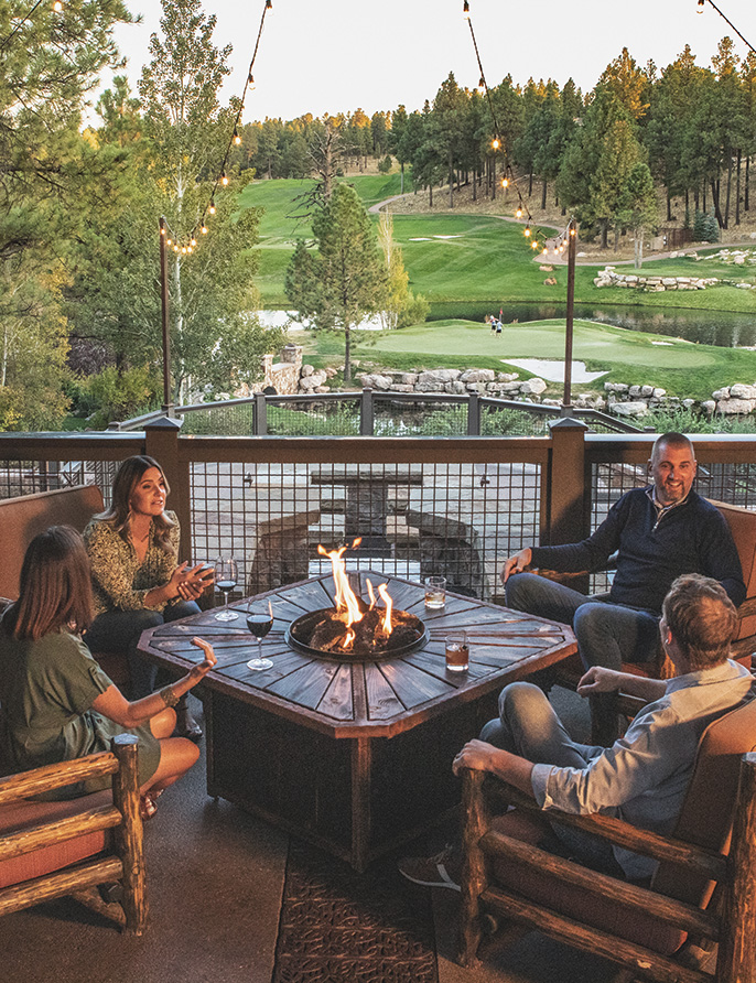
Pine Canyon is a private golf community in Flagstaff, Arizona. The community’s luxury cabins offer owners an escape among pines, mountains and premium amenities infused with a sense of hospitality that isn’t easily found in a residential setting. Pine Canyon pivots on providing opportunities for its owners to discover a coveted, balanced life at every turn.
The Challenge
After being purchased by a new ownership group during the thick of the Great Recession, Pine Canyon experienced modest success but was still unable to meet or beat investor pro forma, despite offering a unique experience for its owners and members. The messaging being used was not connecting with its desired audience in a way that would inspire buyers to act. Pine Canyon needed to stand out from its competitors in the space and it needed to better understand, and more appropriately relay, its value to its audience.
The Tools
The Opportunity
Designed as a retreat for its owners, Pine Canyon’s most appealing attribute is its role as a genuine refuge for those who purchase a home in the community. Through its Anatomy Profile work, part of WHYFOR’s proprietary L.A.B.S. process, WHYFOR determined Pine Canyon, to that point, was trying to sell houses, dwellings where someone lives. But they really needed to sell homes — a place where someone belongs.
Why? Because that’s what their buyers craved.
WHYFOR’s Anatomy Profile determined Pine Canyon was more than a neighborhood. It was a place to disconnect in order to reconnect — a sought-after escape filled with indulgence, serenity, hospitality and luxury. WHYFOR worked to ensure that its branding would reflect its anatomy.
The creative concept:
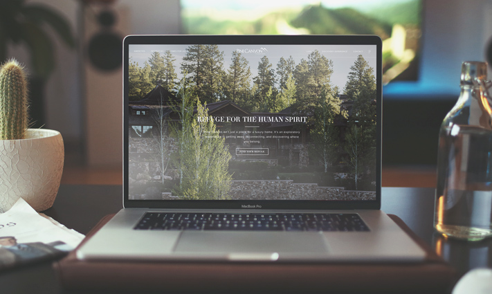
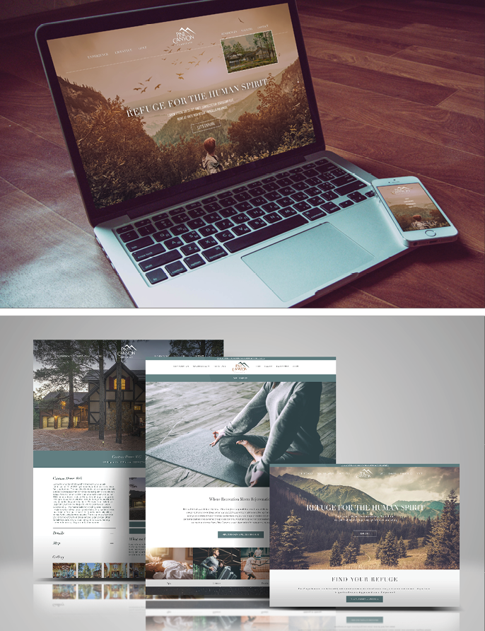
Messaging and muted but sensory-rich visuals became key elements of Pine Canyon’s new look and feel as a result of WHYFOR’s Anatomy Profile. A messaging matrix developed with desired language for Pine Canyon acted as a reference tool for all branding efforts, creating a direct connection between buyers and the feeling they get when they’re at Pine Canyon.
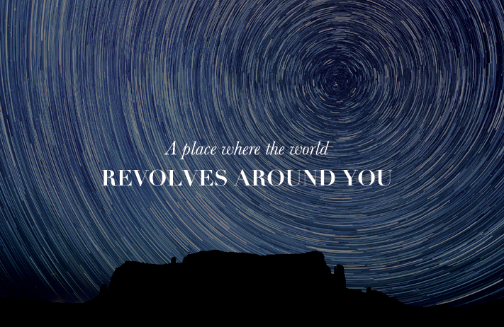
A new tagline, “A refuge for the human spirit,” captured the essence of everything Pine Canyon offers — a place to belong.
The aha moment:
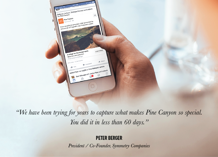
Once WHYFOR completed its Anatomy Profile and developed messaging that more appropriately reflected Pine Canyon’s DNA, the branding quickly began to resonate with prospective buyers, with owners and with staff. Pine Canyon became known as a true refuge, where members play world-class golf, owners take advantage of opportunities to explore and experience indulgent luxuries, and real estate options allow for the creation of a legitimate retreat from all of life’s typical distractions.
WHYFOR recognizes that the success of Anatomy Profile work is difficult to measure. How, after all, does one measure a feeling?
When it takes hold — that’s when. When PGA golfers reference the messaging. When a sales team adopts and leverages strategic phrasing. And, when prospective buyers use the same language about Pine Canyon that they’re consuming.
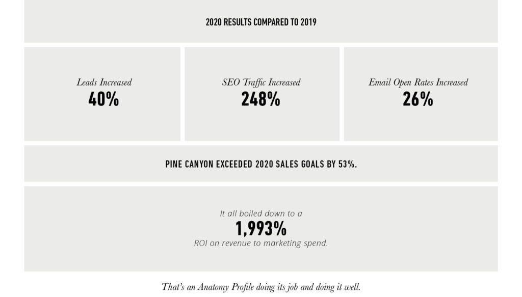
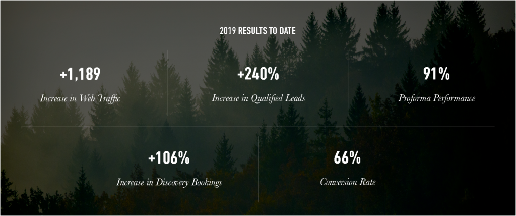
Numbers tell the story, too, as WHYFOR used its Anatomy Profile work as a strong, strategic foundation for its tactical plans. The results?

Vantage West
Client Background
With 150,000 members and $1.9 billion in assets, Tucson-based Vantage West is ranked by the Phoenix Business Journal as the third-largest credit union in the state. Vantage West specializes in helping regional individuals and businesses prosper through careful and strategic financial management and planning. With 19 branches from Tucson and Tombstone to Casa Grande and Greater Phoenix, Vantage West has a distinct and diverse set of target audiences, ranging from students to retirees.
The Challenge
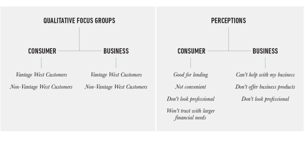
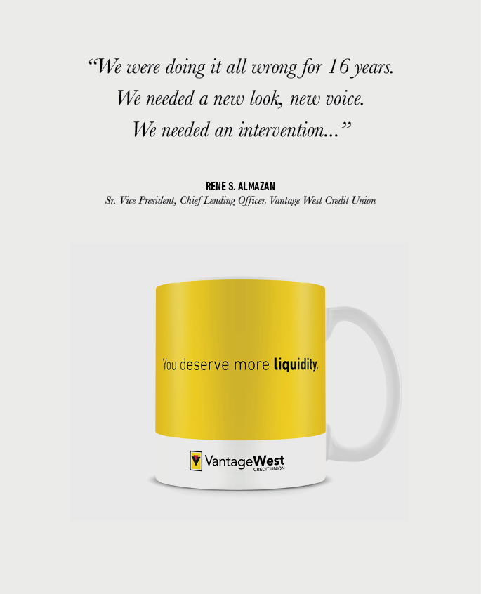
In the 16 years before partnering with WHYFOR, Vantage West had lost their way, lost the confidence of consumers with big financial decisions, lost market share to the big banks due to lack of technology, and lost their ability to connect to the community because they’d lost track of who they are. By their own admission, they “needed an intervention” to create a respected financial brand that connected with consumers – and didn’t just compete on interest rates.
The Tools
The Market Research
The Opportunity
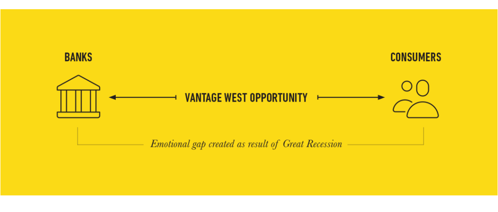
What Vantage West lacked in technology, they made up in service. WHYFOR saw the opportunity to capitalize on the emotional gap between consumers and banks that the financial crisis had created. We needed to move Vantage West across that gap to the consumers—not by selling, but by talking with and relating to them. Communities are made up of people, and Vantage West understood that better than the big-name banks, because they were the community.
The Creative Concept
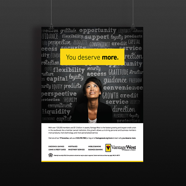
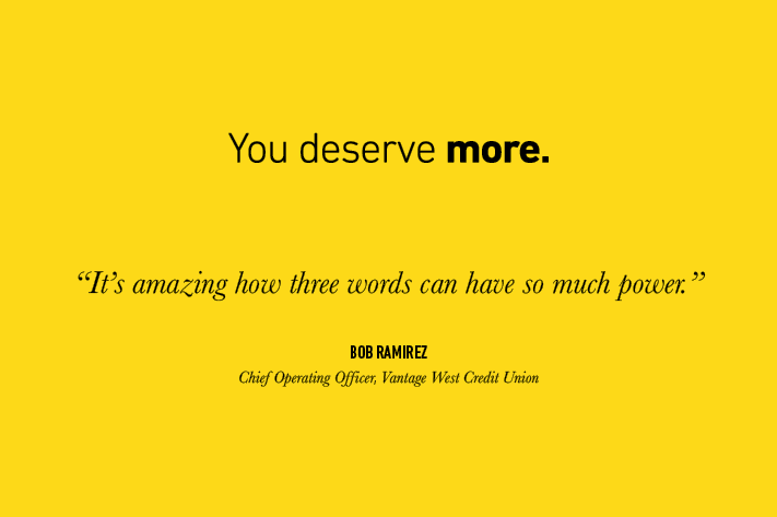
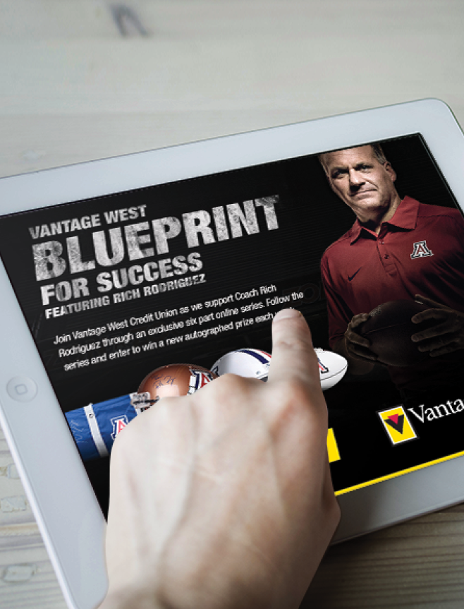
The answer for Vantage West required finding their voice and developing a brand that could connect to individuals authentically and in ways relevant to their needs. The answer wasn’t in technology; it was in the human connection. WHYFOR’s concept, “You deserve more,” provided the bridge Vantage West needed and became a brand mantra. It was direct, powerful, and poignant. Equally important, it served as the launch pad for a wide range of creative campaigns that connected Vantage West products to specific consumer needs: You deserve more security (financial planning), more flexibility (accounts), and more opportunity (lending). In TV, radio, print, and online formats, the design approach and messaging strategy ranged from serious to playful – always acknowledging the frustrations of typical banking customers, while reassuring them that the Vantage West brand not only offered a product line competitive with big banks, but connected in ways that were far superior.
The Aha Moment
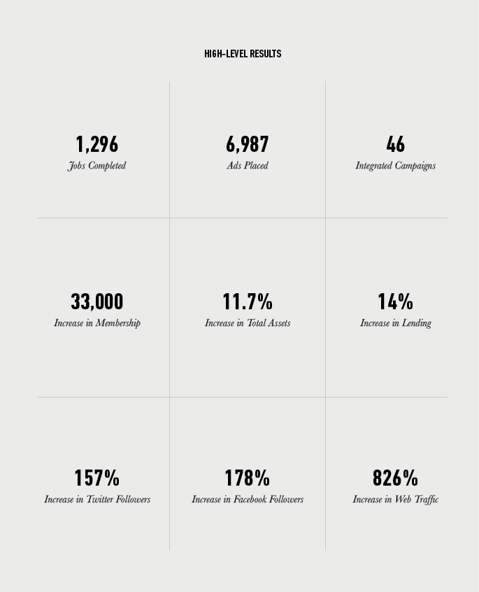
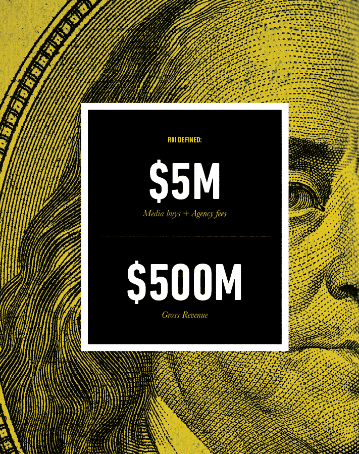
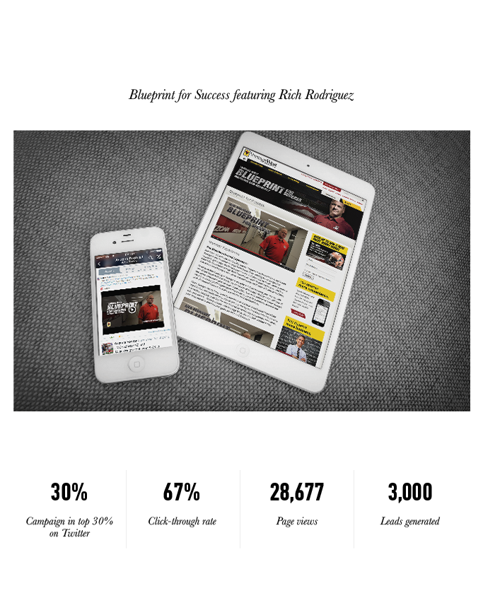
Although WHYFOR helped Vantage West turn a $5 million investment in agency fees and media buys into $500 million, our biggest success was when Tucson Mayor Jonathan Rothschild unexpectedly referenced the campaign during his State of the City address in 2016.
He noted that he wished more companies were like Vantage West, speaking about how the city’s residents deserved more as a community.

Sundt Construction
Client Background
Founded in 1890, Sundt Construction, Inc. is one of the country’s largest and most innovative and respected general contractors, performing work in the transportation, industrial and building markets. The 100 percent employee-owned company is consistently ranked among the 100 largest general contractors in the United States and was named the nation’s safest construction company by the Associated General Contractors of America in 2006 and 2016.
The Challenge
With three business units, Sundt sought to build a brand that accommodated those distinct voices to market themselves, but also fostered a unified culture. Sundt was losing market share to bigger and smaller competitors in new and existing markets across the country. As one member of the executive team described it, they were losing opportunities for RFPs because “people don’t know who we are…we don’t know who we are.” As a result, Sundt was looking at a decline in revenue – despite a thriving economy – and they were losing recruiting opportunities to smaller firms that understood how to build a brand that connected with prospective employees.
The Tools
The Inspiration
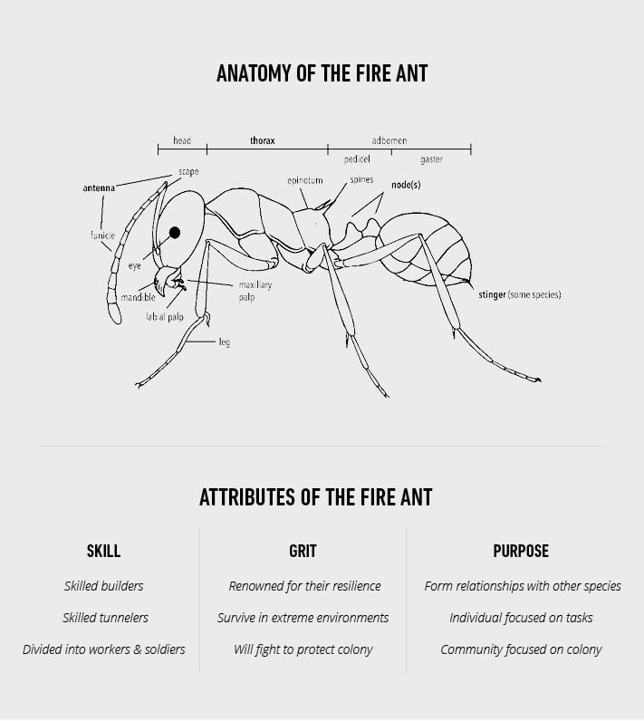
During a hike on Camelback Mountain in Phoenix, WHYFOR founder Rob Nicoletti sat down on a rock and noticed a line of fire ants marching in a column across the desert trail. (Yes, they got his attention when one of them bit him on his hand.) It occurred to him that they were emblematic of the Sundt culture: vulnerable as separate entities, yet coming together and working relentlessly for a common purpose; humble, yet incredibly successful at constructing enormous, complex structures.

When he returned to the office, Rob began researching and found that fire ants were an even better business metaphor than he realized: an incredibly resilient species of builders and tunnelers that can survive extreme heat, cold, and drought. During floods, fire ants raft together, rotating the stronger colony members below the water while the weaker ones stay protected on top – much in the way Sundt’s different business units support each other during challenging times. Finally, they have uniquely synergistic relationships with other insects, which was analogous to Sundt’s reputation for successful collaboration with other builders, architects, designers, and city engineers and planners.
The Creative Concept
The question then became how to apply this micro concept to the overall brand positioning and its use within a diverse company that’s capable of building anything from skyscrapers and NASA launch pads to numerous buildings at the University of Arizona.
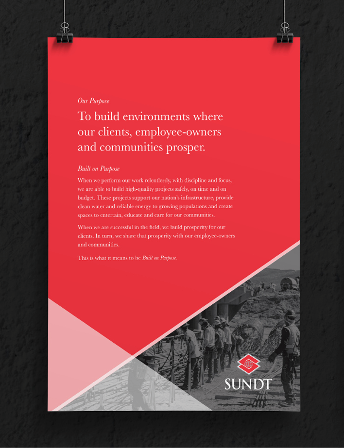
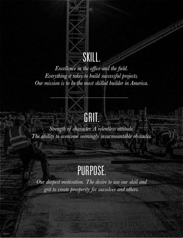
The rebranding process was a comprehensive exercise that included employee surveys and discussions with upper management. In alignment with the so-called Sundt-speak that had evolved over more than a century, the creative team defined every element from mission statements and taglines to a purpose statement: “To build environments where our clients, employee-owners and communities prosper.” In keeping with the fire ant theme, the WHYFOR creative team condensed the internal messaging into a simple phrase to reflect Sundt’s core values: “Skill, Grit, and Purpose.”
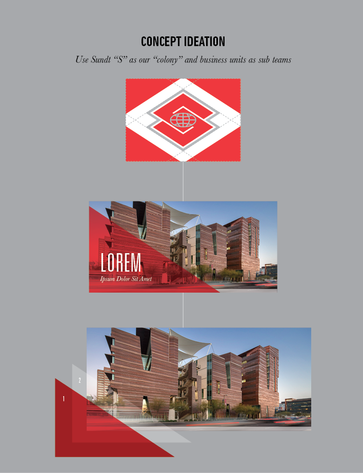
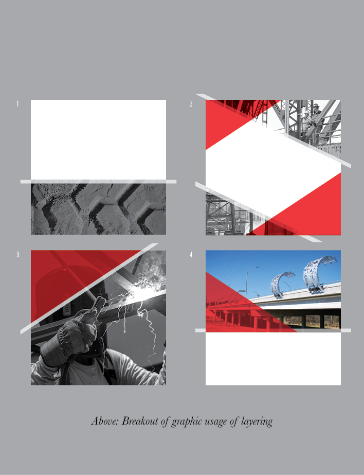
While the longtime Sundt “S” logo was retained, the brand guidelines and design approach needed to present a more cohesive visual image for the four business units. The “S” became the center of the colony, creating segmented lines and patterns that could be layered with the brand colors, different textures, and appropriate photography to distinguish the separate industries in everything from business cards and brochures to digital communications. The graphic design scheme reflects WHYFOR’s philosophy of “Design with Purpose,” providing content in small, medium, and large segments to facilitate influence depending on the level of reader interaction (awareness, interest, consideration or decision).
Pine Canyon
Client Background
Pine Canyon is a 620-acre private, luxury community in Flagstaff, Arizona, developed by Scottsdale-based Symmetry Companies. In addition to its 18-hole championship golf course, Pine Canyon prides itself on its overall lifestyle, recreation, and real estate options.
The Challenge
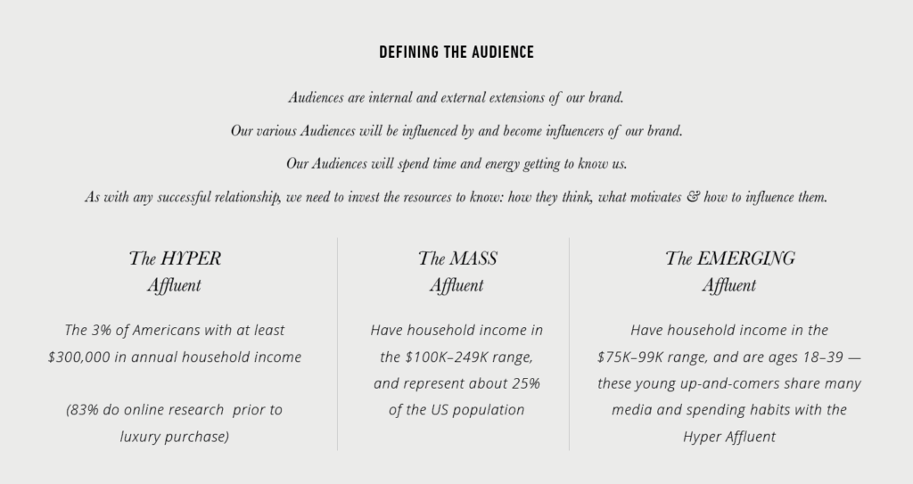
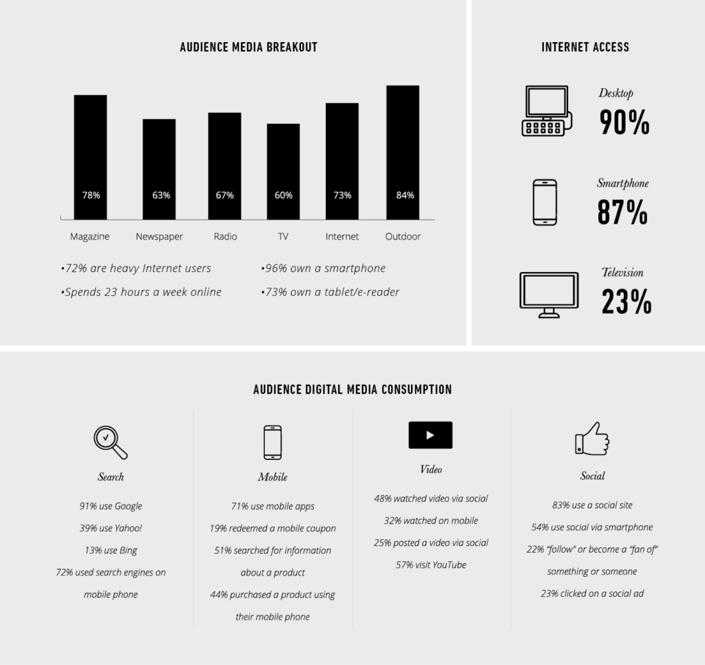
Influencing the top 1%–5% wealth cohort is notoriously difficult – a hyper-affluent demographic with the means to purchase a $3–$5 million home anywhere. While the quality of the homes, lifestyle, and overall environment of the Pine Canyon community represented an excellent match for the audience, the marketing had historically failed to find a way to influence consumer preferences to choose a home at Pine Canyon instead of a house with a competitor. In addition, the quality of the graphic design, web design, copywriting, and overall communications were not aligned with the expectations of a high-end audience – exacerbated by siloing between different departments.
The Tools
The Creative Concept
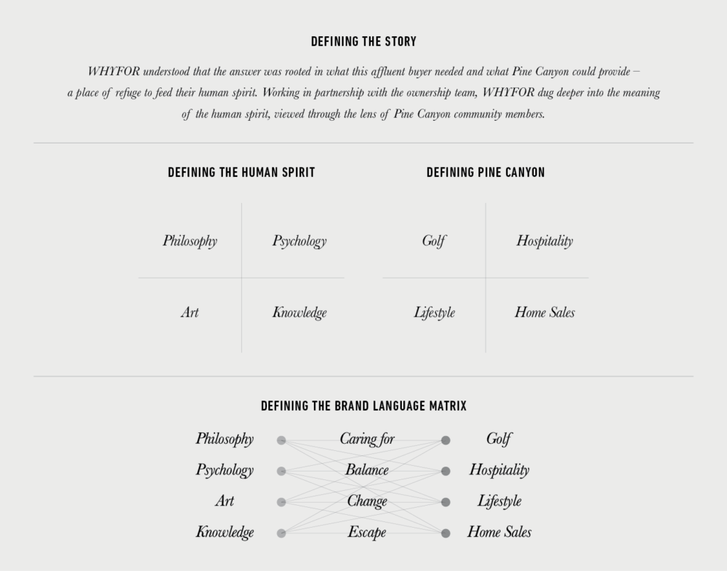
To drive Pine Canyon beyond a simple transactional mindset required rethinking the brand’s anatomy in every respect, as well as gaining a better understanding of the audiences they wanted to reach and the communication vehicles used to reach them. WHYFOR understood that the answer was rooted in what this affluent buyer needed and what Pine Canyon could provide – a place of refuge to feed their human spirit. Working in partnership with the ownership team, WHYFOR dug deeper into the meaning of the human spirit, viewed through the lens of Pine Canyon community members and the perspectives of art, psychology, knowledge, and philosophy. The four components of Pine Canyon – golf, wellness, hospitality, and home sales – needed to work in concert rather than as separate entities.
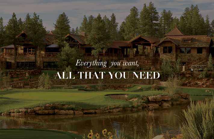
The outcome was an understanding that Pine Canyon offered something that can’t be attached to a dollar amount: a recognition that there is a difference between a house (a building you just live in) and a home (a place where you belong). Ultimately, this led to the creation of several emotion-evoking taglines, “A Refuge for the Human Spirit,” “A Place Where the World Revolves Around You,” and “Everything You Want, All that You Need.”
Creating a unified message also warranted transitioning to a hub-and-spoke model for all marketing and advertising communications. During the past year, these concepts have been implemented top-to-bottom in Pine Canyon’s messaging, from the design of a new website and community brochure down to daily social media campaigns and email marketing blasts. Regardless of the department, each communication explicitly conveys the value of the community as a place to unplug, escape, and connect with family, friends, and nature.

Carrington College

Client Background
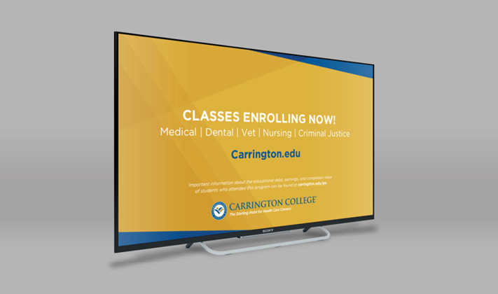
Carrington College is a for-profit educational institution with a focus on certificate and associates programs in the medical, dental, veterinary, and criminal justice fields. Carrington serves about 5,000 students at 21 campus locations and 8 learning centers in the West, as well as through online programs.
The Challenge
The for-profit education field isn’t just competitive – it’s saturated. Carrington College was struggling not only to be heard above the crowd, but to find its unique voice in a way that could influence preferences vs. their peers. The Carrington marketing team hadn’t adapted to the changing times of branding and was relying on outdated practices to move the needle. At the time they partnered with WHYFOR, the school was solely focused on paid ads and social media. Unfortunately, they were ignoring an ironclad truth in the advertising world: Paid media can alter perception, but it’s almost impossible to use it for changing preferences. The latter requires relationship building and showing people an experience.
The Tools
The Research
When WHYFOR joined the project, Carrington had already developed demographic personas to understand their target student. Combing through the data, it was essentially a big haystack with very few needles. Furthermore, the WHYFOR research team interviewed students, alumni, and faculty, and found that much of the information was either irrelevant or misleading. One key discovery, for example, was that many of the school’s students did not have Wi-Fi in their own homes, and they would need to go to McDonald’s or Starbucks to go online. Another was that many of them were single moms, for whom juggling daycare and going to class was a challenge.
WHYFOR performed secret shopping, not only to better understand the student application process but to verify whether Carrington’s for-profit model and strategies fit within our own values prior to working with them. To augment that research, WHYFOR thoroughly examined the current campaigns being promoted by other for-profit schools and looked at marketing, data, and employment trends.
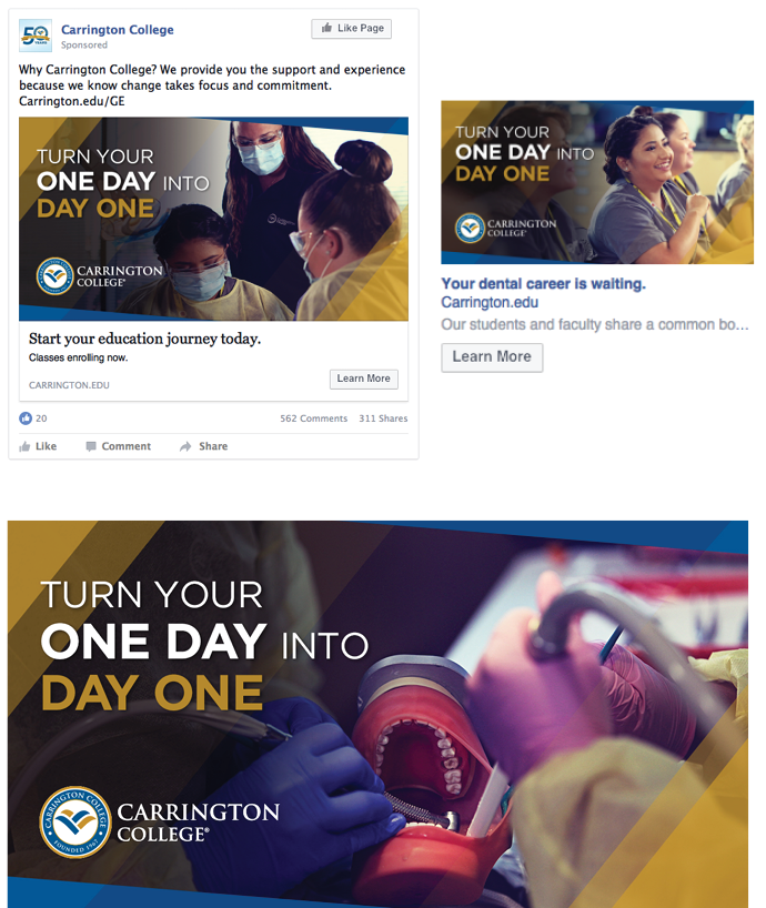
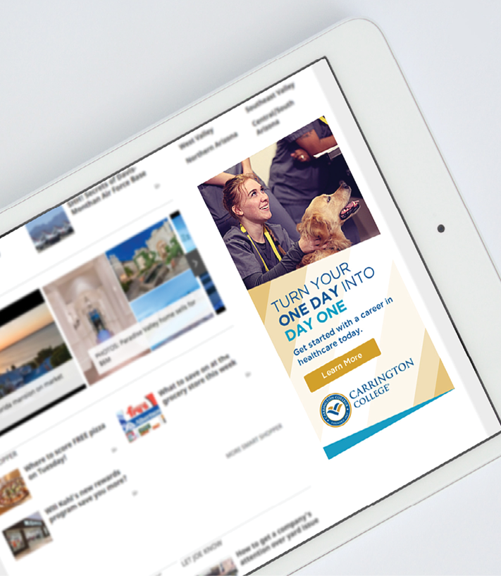
Turn Your One Day Into Day One
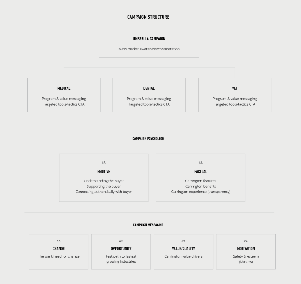
At a high level, WHYFOR used Maslow’s hierarchy of needs to interpret the psychology and motivations of prospective students. Based on the research, the creative path was driven towards two specific audiences. The first was people living paycheck to paycheck, struggling to make rent. For them, education serves as safety. The second group was those looking to improve their lives and reach higher aspirations. For them, education serves as esteem.
On a practical level, WHYFOR uncovered the answer that bridged the two audiences – and an element that Carrington’s competitors missed – was in inspirational storytelling. In life, it’s easy to see what success looks like, but it’s not always clear how to get there and it’s easy to put off. With the campaign tagline “Turn Your One Day to Day One,” WHYFOR made that connection explicit. There’s a day one when you submit your application, when you walk into your first class, when you graduate, and when you get your first job – with Carrington’s support structure transitioning into your career and serving as the bridge that prepares you for all your future day ones.

The Aha Moment
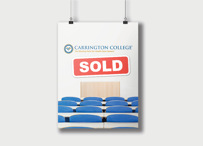
This might be the most honest commentary in a case study you’ll ever read. Due to Carrington’s sale after only 5 months of the campaign, the project can best be described as a partial success. The creative was so well received that the Carrington CMO asked us to pitch his counterpart at their parent company, DeVry – something that had never occurred before during their relationship.
While the sale came as a surprise, the results were positive enough that the incumbent agency continued running the campaign. Even if somewhat bittersweet, that was a testimony to what sets WHYFOR apart from other agencies: not just doing the creative work, but helping brands grow and evolve. Ultimately, however, the execution by the brand itself hindered it from achieving its full potential of changing the perception of Carrington.